I used to think office paint was just background noise, the thing you only notice when it is chipped or a strange shade of beige. Then I visited a friend’s dev shop that had just worked with an interior painting in Denver company, and it felt like someone had upgraded the entire space without changing the furniture or the hardware.
If you only want the short version: good commercial painting in a tech workspace is not just about nicer walls. It can reduce glare on screens, support focus and deep work, make collaboration zones feel more active, help with wayfinding, protect expensive hardware from dust and moisture, and even support brand and hiring goals without shouting about it. In a city like Denver with its bright sun, dry air, and mix of old and new buildings, the right paint choices can have a real effect on how people code, design, and ship products day to day.
Why tech teams should care about paint at all
If you write code, manage infra, or run a product team, paint might sound like decoration. Pretty, but secondary.
I think that is slightly wrong.
Modern tech work is fragile in a way. It depends on long stretches of focus, fast context switches, and calm collaboration. Small annoyances build up:
– Monitor glare in the afternoon
– Flicker from bright white walls and LEDs
– Feeling boxed in during standups
– Struggling to find a quiet corner for debugging or user interviews
Paint will not fix broken processes, but it can quietly reduce cognitive friction in the background.
Color, finish, and layout choices affect how your brain tracks movement, manages light, and judges comfort long before you are consciously “looking” at the walls.
Think of paint as infrastructure for attention, not just decoration.
From “office” to “workspace that supports the work”
A typical Denver tech office has a few common features:
– Open floor plan or partial open plan
– Mix of natural light from big windows and strong overhead LEDs
– Teams switching between heads-down work, calls, and whiteboard sessions
– Hardware that actually reacts to the environment: monitors, sensors, audio gear, servers in side rooms
Commercial painters who understand tech spaces pay attention to different questions than a generic office painter:
– How does light hit monitors at 10 am vs 3 pm?
– Where do people cluster for calls and huddles?
– Which walls need to stay calm on camera for remote meetings?
– Where do cables, outlets, and equipment need extra protection from dust and scuffs?
That is where the real upgrade comes from. It is less about trendy colors and more about making thousands of small visual and physical interactions smoother.
Color choices that match how tech people actually work
Here is where it gets slightly subjective. Everyone has a color opinion. Some people like bold walls, others get tired of them in a week. Still, there are patterns that work well in tech offices.
- Neutral base for focus areas
- Bolder accents for collaboration zones
- Readable, calm backgrounds for camera and screens
Neutrals for deep work zones
Engineers and data teams spend long hours staring at code editors, dashboards, and logs. Strong colors directly behind or beside a monitor can cause visual fatigue faster than you might expect.
Commercial painters often recommend:
– Soft grays with a bit of warmth
– Muted blues or blue-grays
– Off-whites with low brightness, not the harsh “rental white” you see everywhere
These shades absorb light more gently and lower contrast around the edges of your field of vision. The result is that text on your monitor feels easier to track over long sessions.
A wall color does not need to be dramatic to change how your eyes feel at 4 pm in the middle of a sprint.
One thing people get wrong is chasing dramatic “creative” colors in dev areas. Bright red behind a triple-monitor setup looks cool in a photo. In real life it can feel loud and distracting, especially in winter when people already feel boxed in indoors.
Accent walls for movement and collaboration
Not every area needs to feel quiet.
For standup corners, war rooms, or design review spaces, a more active color can help signal: this is where we talk, sketch, decide.
You might see:
– Rich but not neon blues or greens for meeting rooms
– Warmer earth tones in lounge areas to separate them mentally from desk clusters
– A stronger accent near whiteboards so that drawing sessions feel like a shift of mode
The trick is to use accent walls as markers, not as a visual assault. One or two well placed accents can:
– Help visitors and new hires navigate the office
– Give teams shared landmarks when they say “meet at the green wall”
– Break up long, monotonous corridors
Camera friendly backdrops for remote teams
If you have remote teammates, or clients on video most of the day, your wall colors show up on camera. That means:
– Avoid pure white behind people on calls. It can blow out the picture.
– Avoid very intense colors behind faces. Skin tones can look strange.
– Soft mid-tone colors tend to look better with common webcams.
Commercial painters who work with tech companies often plan “Zoom walls”: surfaces behind typical seating that produce clean, non-distracting video.
You do not have to turn every call into a brand commercial. In fact, many teams regret going too heavy on bold brand colors in every background. A calmer base with one subtle branded stripe or band can feel more respectful to the viewer.
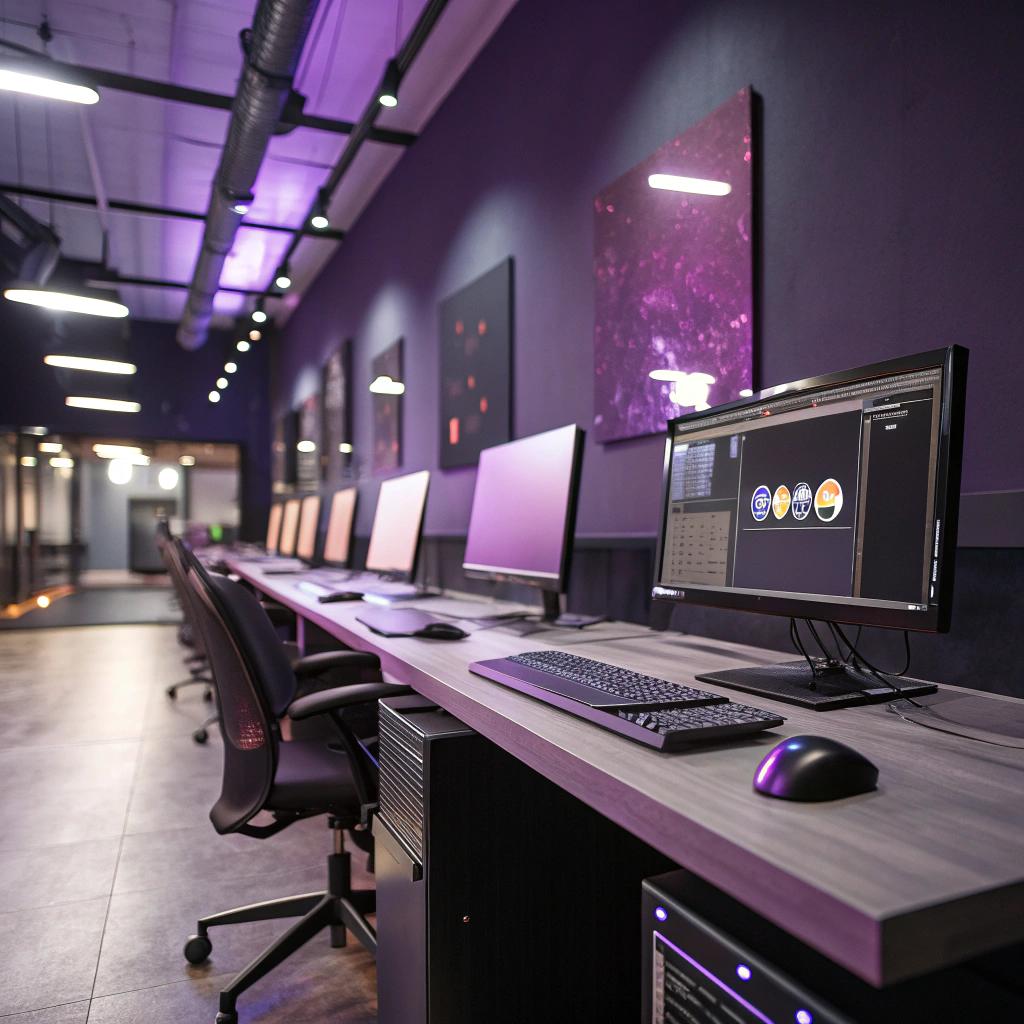
Light, glare, and the Denver sun
Denver has a lot of days with strong sun and high brightness. Nice for hikes. Less nice for monitors if your walls reflect too much light.
Here, paint finish matters almost as much as color.
How finishes affect screens and eyes
Common finishes:
| Finish | Look | Best use in tech spaces |
|---|---|---|
| Flat / matte | Low reflection, soft | Focus zones, walls near big monitors |
| Eggshell | Slight sheen, more durable | Hallways, casual meeting spaces |
| Satin | Noticeable sheen | Kitchenettes, high touch areas |
| Semi-gloss | High reflection | Trim, doors, not near screens |
In many older offices, walls end up with semi-gloss almost everywhere because it is “easy to wipe.” That might help cleaning, but it is rough on people working at screens all day.
Matte or low-sheen paint:
– Reduces reflected light on the edges of monitors
– Lowers the “halo” effect around windows
– Makes LED glare less intense
You still get cleanable surfaces with modern matte and eggshell formulas. This is one area where I think many companies stick to old habits longer than they should.
Planning with actual light, not just a color card
A color that looks calm on a sample card can look harsh in real Denver daylight.
Good commercial painters will:
– Test patches on different walls
– Check them at different times of day
– Look at how they interact with both natural and artificial light
For example:
– A cool gray might feel balanced on the north side of the building
– The same color can look icy on a south facing wall at noon
That kind of nuance sounds minor until you spend a few months in the wrong shade.
If your team is constantly closing blinds in the middle of a bright Colorado day, the problem may not be the windows at all; it might be the way your walls bounce that light around.
Zoning: using paint to define how each area of the office “behaves”
Tech offices rarely have one single mode of work. You need:
– Silent focus
– Casual conversation
– Scheduled meetings
– Quick debugging huddles
– Product demos
– Occasional events
Walls can help guide those behaviors without big signs everywhere.
Focus zones vs collaboration zones
You can think in simple categories.
- Focus zones: calm, muted, low contrast
- Collaboration zones: a bit more color, some energy
- Transition zones (hallways, entries): slightly stronger color to signal movement
Examples:
– Dev pods with neutral matte paint and very light accents
– Standup areas with one stronger colored wall and whiteboard-friendly paint
– Kitchen and break areas with warmer, more social shades
This kind of zoning helps people shift mode:
– Walking from a neutral pod into a stronger color meeting area feels like “now we talk”
– Returning to the quiet palette reminds your brain “back to building”
It sounds a bit psychological, because it is. Human brains are pattern seeking. Color and contrast are strong signals, even if you do not consciously think, “Ah, this is the collaboration zone.”
Color coding by function
Some teams also use soft color coding, especially in larger offices:
– Support and ops areas share one accent color
– Product and design another
– Shared meeting rooms a third
Not strict, not corporate, just hints. This can help new hires orient themselves and reduce the endless “where is that room again?” questions.
The key is to keep it light. When every team is fighting to own “their color,” you lose coherence, and the office starts to look like a patchwork app store.
Protecting hardware, cables, and infrastructure
One thing people often ignore is the physical side. Tech offices are full of:
– Racks and miniservers
– Cable runs and wall outlets
– Mounted screens and tablets
– Sensors, access points, and camera gear
Bad paint choices can complicate maintenance. Good ones can help it.
Durable finishes where equipment lives
In areas with a lot of hands, carts, and hardware movement, commercial painters usually go with:
– Higher durability paints
– Slightly higher sheen where monitors or carts might brush the wall
– Products with better resistance to scuffs and cleaning agents
Think about:
– Walls near standing desks that move up and down
– Hallways where people wheel AV carts or demo rigs
– Spaces behind big display screens
Protecting those surfaces means:
– Fewer visible marks that make the office feel worn
– Less dust build up clinging to rough or peeling paint
– Safer cleaning around cables and power strips
Color for access and maintenance
There is also a practical benefit to thoughtful color use near infrastructure.
For example:
| Area | Helpful paint choice | Why it helps |
|---|---|---|
| Server closets | Lighter walls | Reflect more light so techs can see labels and cables |
| AV control panels | Neutral background | Reduces visual noise when tracing lines and ports |
| Access panels & conduits | Slightly contrasting trim | Makes future access easier without hunting |
None of this shows up on a website tour. Your clients will not care that your server room has helpful wall colors. But your ops team will appreciate it on a rough day.
Branding without making the office feel like a billboard
Tech companies argue a lot about how visible the brand should be inside the office.
Some push the logo and brand color everywhere. Others want to avoid any “corporate” feeling. Both extremes can feel off.
Commercial painters who work with tech firms in Denver often suggest a middle path.
Subtle brand presence
Instead of coating every wall in the main brand color, it can work better to:
– Keep 70 to 80 percent of walls in neutral, humane tones
– Add brand colors in smaller but clear elements
– Use paint to frame logo signs or key visuals rather than replace them
Examples:
– Brand colored stripe in the reception area at eye level
– One strong accent wall in the main all hands or demo room
– Calm walls elsewhere, so laptops and monitors do not sit against aggressive backgrounds
Brand is still present, but people do not feel like they work inside a marketing deck.
Hiring and culture signals
Candidates and partners pick up more than you might think from the painted environment:
– Are there quiet, neutral focus areas? That signals you care about deep work.
– Do meeting rooms each have a slightly different mood? That hints at flexibility.
– Is every single wall white? That can suggest “temporary” or “we did not think this through.”
You can over-read this, of course. But the signals exist.
Paint is often the cheapest part of an office fit-out, yet it is almost always the thing that covers the largest visible area.
So even small investments in tone and layout pay off in how people feel about your company as a place to work.
Different tech spaces, different painting strategies
Not every Denver tech space looks like a classic startup office. Commercial painters adapt approaches based on how you work, not just how you look on LinkedIn.
Open office with many teams
If you have dozens or hundreds of people, sound and movement become just as big a challenge as visual comfort.
Painting tips that often help:
– Group nearby teams with similar calm base colors
– Use stronger tones only at the ends of long corridors or at key nodes
– Keep most surfaces in low sheen finish to avoid the sense of constant movement at the edge of your vision
In a large space, even mild reflection can make it feel like there is always motion in your peripheral vision. That gently drains focus over time.
Hybrid or flexible spaces
Many Denver tech teams now use flex desks and rotating in-person days.
For hybrid setups, it can help when the paint plan:
– Makes each function obvious, since “this is my desk” is no longer the anchor
– Keeps backgrounds camera friendly for remote last minute calls
– Avoids harsh contrast between empty and busy days
For example, a flex area might have:
– Neutral walls with a low-key color band that runs along the whole space
– Meeting booths in a slightly deeper shade, to feel distinct but not isolated
– Larger, brighter color marks only where people first enter, not across every desk pod
This keeps the space from feeling chaotic when half the seats are empty.
Specialized areas: labs, VR rooms, testing spaces
Some tech offices include:
– Hardware labs
– QA testing spaces
– VR or AR demo rooms
– Small maker or R&D corners
Each has its own needs.
In a VR room, for example:
– Darker but not pitch black walls can help the virtual scene feel more solid
– Very strong patterns on walls can break immersion if people catch glimpses when adjusting headsets
In a hardware lab:
– Light, cleanable walls make it easier to see fine hardware parts
– Slight color contrast near benches can help spot dropped screws or small components
Commercial painters who listen to the people using these rooms will get much better results than those who treat them like generic offices.
Practical planning with a commercial painter
If you are involved in planning a repaint, you do not have to turn into a design expert. But you will have a better result if you go into the conversation with some structure.
Map your work modes before picking colors
Instead of starting with swatches, start with a simple sketch of how work happens.
Ask questions like:
– Where do people spend most of their screen time?
– Where are the loudest parts of the office?
– Which rooms are on camera the most?
– Where do visitors go first and last?
Then connect that to painting goals:
| Work mode | Paint priority |
|---|---|
| Deep focus coding | Low glare, neutral, soft contrast |
| Team collaboration | Subtle energy, clear whiteboard walls |
| Video calls | Camera friendly, calm backgrounds |
| Visitors & clients | Brand presence, but not visual noise |
Bring that map when you talk with a painter. If they skip these questions and jump straight to “What color do you like?” then I would be a bit cautious.
Coordinate with IT, not just office managers
Painting can affect:
– Where monitors will reflect light
– Which walls need extra hidden mounts or cable access
– Timing for moving hardware out of the way
IT and facilities should both be in the loop. Some details to cover:
– Are there sensor devices or panels that must not be painted over?
– Where do cable runs need to stay visible?
– Any racks or hardware fixed to painted surfaces that need careful masking?
Skipping IT in planning leads to small daily frustrations after the project is done.
Common mistakes tech companies make with office paint
To be fair, painting an office is not the hardest thing a tech team does. But there are some recurring missteps that are easy to avoid.
Too much white everywhere
Pure white feels safe. Landlords love it. It is also:
– Harsh with Denver sun
– Unforgiving with LED strips
– Flat and tiring for long focus sessions
A very light gray or off-white already works better in many rooms. The difference looks small in photos, but big across an entire workday.
Brand color overkill
Putting your main brand color on every wall might feel consistent. Often it just feels loud.
Better to treat brand color as one tool:
– Use it where presence matters: entry, all hands, a main meeting room
– Repeat it in subtle trims or bands
– Let most spaces breathe in softer tones
People remember thoughtful use of color more than sheer volume.
Ignoring acoustics and material interaction
Paint interacts with other materials:
– Glossy paint on flat, hard walls beside glass can reflect both sound and light
– Super dark colors in small rooms can make them feel cramped on camera
– Very smooth finishes can amplify tiny echoes
So while paint is visual, it also affects how a room sounds and feels. That subtle cross effect is why “this room looks great but feels weird” happens.
Small upgrades that feel big to the people who work there
Not every tech company can afford a full office redo. You might be in a leased space, or just being sensible with cash.
Still, there are smaller painting projects that can lift daily experience more than you might expect.
Low effort, high impact paint changes
Some examples that often work:
- Repainting only the walls directly behind or beside main dev pods to reduce glare
- Adding one or two calm, camera ready backgrounds in shared call rooms
- Refreshing the entry and reception wall with a more welcoming tone and subtle brand reference
- Giving server and hardware rooms better lighting support through lighter, non-gloss walls
Each of these projects is contained. You can schedule them on weekends or during low-traffic periods, and still see a real shift in how people describe the office.
Listening to your own team more than trends
One final thought: tech blogs and design sites often promote dramatic, “Instagram ready” offices. Slides. Neon signs. Very dark or very bright walls.
Some of that is fine, some is just noise.
If your team says:
– “My eyes are tired at the end of the day”
– “It is hard to be on video here”
– “The office feels busy even when it is quiet”
Then those should guide painting choices more than some trend. A good Denver commercial painter will listen for these clues and translate them into finish, color, and layout choices that suit your actual work, not a staged photo.
Common questions about commercial painters and tech offices
Q: Does repainting really affect productivity for a tech team?
A: It will not turn a weak product into a strong one, but it can reduce small daily drains on attention: glare, eye strain, background distraction, visual noise on calls. Over time, those small gains matter more than one big dramatic change.
Q: How often should a tech workspace be repainted?
A: Many offices repaint high traffic areas every 3 to 5 years, and focused refreshes happen more often when teams grow or layouts shift. If your walls show heavy scuffs, peeling, or dated colors that no longer match how you work, that is usually a clearer signal than the calendar.
Q: Is it better to follow strict color psychology rules or just pick what people like?
A: Overly strict “blue means focus, red means energy” rules can feel fake. On the other hand, ignoring basic comfort leads to glare and fatigue. A balanced approach works best: respect general patterns about light, reflection, and calm vs active zones, but then test real colors with your actual team and adjust based on how they respond.