I used to think paint was just a color choice, nothing to do with tech or smart homes. Then I watched a friend finish a full home automation setup, only to realize the beige walls were making his smart lighting look flat and kind of sad.
If you want your smart home to actually look smart, the fastest upgrade is a new paint plan that works with your lighting, screens, sensors, and devices. Working with a team that understands that, like residential painting Chico, means you are not just changing color; you are tuning the “visual operating system” of your home so your tech and your space feel like they belong together.
Why paint matters more when your home is smart
If your house has smart bulbs, smart thermostats, speakers, cameras, and a couple of screens in every room, then your walls are not neutral anymore. They are part of the interface.
Paint affects:
- How colors look on your smart bulbs at different color temperatures
- How sharp your TV or projector image feels
- How visible your sensors and cameras are
- How your phone and tablet photos look in each room
Paint is not just background. In a smart home, it behaves more like a constant filter over everything you see.
I used to ignore this and just pick “whatever light gray is trending.” Then I started to notice weird things:
– My “warm white” scenes felt too orange in one room and perfect in another
– My white smart switches looked yellow against some walls
– The camera on my video doorbell kept blowing out the highlights near a bright doorway
Color, gloss level, and even small texture choices all change how your tech feels in daily use. That is where a good painting plan, and not just a quick repaint, starts to matter.
Planning paint around smart lighting and screens
The first smart detail to think about is simple: your lighting is not fixed anymore. Smart bulbs can shift from warm to cool, and sometimes into full RGB color. Your paint has to behave nicely across that range.
Color temperature and how it plays with wall paint
Warm white (around 2700K) and cool white (around 4000K or higher) pull very different reactions from the same wall color.
Here is how they usually interact:
| Lighting mode | What you see | Better wall colors |
|---|---|---|
| Warm white, cozy scene | Yellows and reds get very strong, cool colors can look muddy | Greige, soft neutral beige, muted greens |
| Cool white, “focus” or “work” scene | Blues and grays pop, warm colors can look a bit dull | Light gray, blue-gray, cool white with a hint of color |
| RGB color scenes | Strong colored light can reflect and tint the whole room | Very neutral walls with low saturation |
If you mostly run warm scenes at night, bright cool gray can look harsh. If you like cool daylight scenes during the day, yellow-based beiges can feel heavy and stale.
A simple rule: the more color your lights can output, the less color you often want in your walls.
So before you pick paint, ask yourself:
– Do you use warm light at night and cool light in the morning?
– Do you ever use bright colored scenes, like blue or purple, for movies or gaming?
– Do you run “daylight” scenes even after sunset to stay alert?
Those habits should guide the level of warmth or coolness in your wall colors.
TVs, projectors, and reflective glare
Screens are picky. If you have a home theater area, gaming setup, or a big living room TV, your paint is part of the picture quality whether you want it or not.
Here is what usually helps:
- Use matte or eggshell near screens instead of semi-gloss, to cut reflections
- Keep the wall behind the TV a bit darker to boost contrast
- Avoid very strong colors behind the screen, they can cast color on the image
If you use a projector, the wall color near the screen matters even more. Light walls bounce more light back into the room and can wash out shadows. A darker neutral around the screen area keeps focus on the image.
Some people go all in and paint a “media wall” in a deeper tone. Others just tint it slightly darker than the rest of the room. Both are fine. What matters is reducing glare and stray reflections from smart bulbs or windows.
When your smart lighting looks better on camera
If you take many video calls or record content at home, paint also affects how your background looks to other people.
You might notice:
– Pure white walls can blow out on camera
– Strong color walls can cast weird tints on your skin
– Glossy finishes can create hot spots behind you
For camera-friendly walls:
Soft, light neutrals with a matte finish usually give you the cleanest, most forgiving background for calls and content.
Think light gray, greige, or soft beige rather than bright white or bold color, at least behind your main work setup.
Hiding, framing, or showcasing your tech with paint
Smart homes come with a lot of visible hardware. Switches, hubs, smart speakers, wall-mounted tablets, thermostats, cameras, and so on. None of it is invisible.
Paint can do three useful things here:
- Hide tech so it fades into the background
- Frame important devices so they stand out
- Blend old hardware and new hardware into a cleaner look
Making sensors and switches disappear a bit
Not every device needs to shout for attention. Some are better when they just work quietly.
To downplay visual clutter:
– Match wall color to your main smart switch or thermostat color when possible
– Use soft neutrals so white devices do not look too loud
– Avoid strong patterns near small devices, as they make them more obvious
If you have a hallway with motion sensors, access panels, and two or three switches, a calm mid-tone can feel less chaotic than stark white. Your eye stops catching every edge and box.
Framing “hero” devices and screens
Some tech deserves focus. A wall-mounted tablet that controls the house. A large TV used as a dashboard in an office. A beautiful speaker that also works as decor.
You can support that with paint:
– Paint the wall behind a hero device one or two shades darker than adjacent walls
– Keep that wall more solid and simple, no busy patterns
– Use a finish that does not reflect too much light back at the device
This does not need to be dramatic. Even a small shift can create a visual frame that says “this area matters” without shouting.
Color zoning around smart features
If you have multi-room audio, security zones, or different smart scenes for different areas, you can mirror that with paint choices.
For example:
| Home area | Smart feature focus | Paint idea |
|---|---|---|
| Home office | Smart lighting scenes for focus and calls | Cooler neutral wall, low sheen, calm accent behind webcam |
| Living room | Media, smart speakers, mood scenes | Warmer neutral, darker media wall around TV |
| Hall or entry | Sensors, locks, cameras | Mid-tone neutral to hide devices and activity |
| Gaming or hobby room | RGB lighting, screens, maybe streaming | Very neutral walls, maybe a single darker accent away from the camera |
You end up with a home that quietly tells you where you are and what the space is for, even before the automation scene kicks in.
Finishes, textures, and your devices
Tech people sometimes obsess over specs and forget about fingerprints and smudges. Paint finish matters a lot when you have many devices you touch, tap, and bump into.
Choosing paint sheen around smart hardware
Here is a simple guide that tends to work well in a connected home:
| Area | Good finish | Why it helps |
|---|---|---|
| Walls behind TVs and monitors | Matte or flat | Reduces glare and bright reflections on screens |
| Walls with smart switches / thermostats | Eggshell or low-sheen | Easy to clean, still low reflection |
| Hallways with sensors and high traffic | Eggshell or satin | Handles scuffs and finger marks better |
| Ceilings with smart recessed lights | Flat | Reduces bright circles and glare from downlights |
Glossy finishes can make your smart gear look sharper in photos, but living with constant glare is tiring. I think most people find that a more matte finish makes a space feel calmer, especially with several screens in one room.
Textures and wireless performance
There is a small tech angle here that people rarely think about. Heavy textured walls usually need more paint. Very thick coatings, metallic paints, or specialty finishes can affect how signals move, in rare cases.
You probably will not break your Wi-Fi with paint, but:
– Metallic paints can reflect signals in odd ways
– Very dark, dense coatings might hide small cracks where people run hidden cable
If you are planning to add more devices later, talk through any special finish ideas with your painter. Simple, smooth walls tend to play nicer with brackets, mounts, and cable runs as you upgrade your tech over time.
Smart color choices for different rooms
Every room has a different relationship with your tech. It helps to treat them one by one, rather than forcing a single neutral same-color plan across the whole house. That is one place where many people go too far with minimalism.
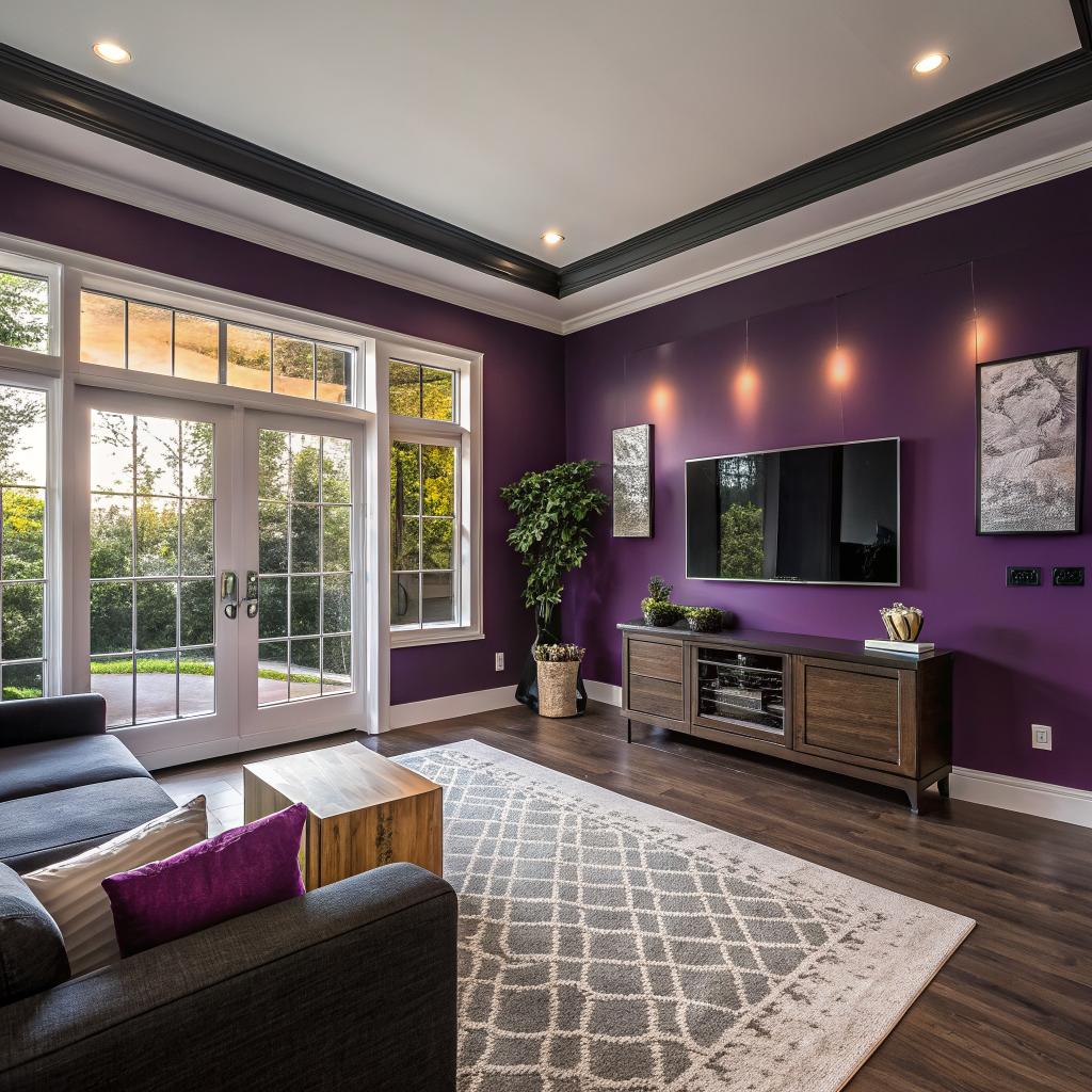
Living room or media room
This is where a lot of smart home gear shows up first: TV, soundbar, smart speakers, remote hubs, maybe some light strips.
You want:
- Comfort for long viewing sessions
- Good contrast for the TV
- Lighting that can shift from daylight to movie night
Practical paint ideas:
– Keep the main media wall a touch darker than the rest, in a neutral tone
– Use matte on the media wall, eggshell on the remaining walls
– Avoid strong blues or greens right next to the TV, they can affect how warm or cool the image feels
I have seen people try dark navy or charcoal on the TV wall with great results, but it can feel too heavy if the rest of the room is small. A mid-tone gray is a safer middle ground.
Home office or workspace
Here the tech is all about work: monitors, webcams, speakers, smart lights, maybe smart blinds.
You want:
– A background that looks clean on camera
– Color that does not tire your eyes on long days
– Walls that will not reflect screen glare back at you
Good choices:
Cooler neutrals in the blue-gray range can help you stay more alert, while still looking professional on video calls.
You might:
– Paint the wall behind your monitor a bit darker to cut contrast and glare
– Keep the wall behind your webcam lighter and simpler
– Avoid highly saturated colors near your face, they can tint your skin tone on camera
Some people prefer warmer tones because they feel more relaxed. That is fine too. The key is to test your typical lighting scenes with sample swatches before committing.
Bedroom and relaxation spaces
Smart homes are now full of sleep routines, wake-up lights, and noise machines. The paint can support that or fight against it.
For better rest:
– Use softer, lower contrast colors like pale green, blue-gray, or warm off-white
– Avoid very intense reds, bright oranges, or sharp pure white
– Keep finishes matte to avoid reflections from phones or bedtime reading lights
If you have an LED strip behind a headboard or along the ceiling, test it on possible wall colors. Some neutrals suddenly turn strange under colored light. A bit of trial helps.
Kitchen and dining area
Kitchens now have smart speakers, smart displays, connected fridges, and lighting scenes tied to cooking or eating.
Helps to focus on:
– Easy cleaning, especially behind smart displays on the counter
– Colors that still look natural under both warm and cool light
– Keeping reflections off glossy cabinet doors to a reasonable level
You might pick:
– Satin or durable eggshell in high splash areas
– A neutral that does not make food look odd, so avoid strange green or purple tones
– A slightly warmer neutral in the dining area if you want food and skin tones to look more pleasant under warm light
Many people go for white kitchens. They can look great, but if every surface is white, smart displays and appliances can feel like they are glowing too strongly. Softening the walls with a gentle off-white or greige can help.
Hallways, entries, and stairs
These zones carry a lot of tech: motion sensors, cameras, smart locks, chimes, and night lights.
You mostly want them to feel calm and not cluttered, even if there is a lot going on.
Ideas:
– Pick a mid-light neutral that hides small marks and devices well
– Use a washable finish; people brush against walls more here
– Stick to simple color so smart devices do not look chaotic
This is not the place for heavy accent colors if you already have a lot of visible hardware.
Color testing with your smart gear turned on
A mistake I see often is choosing paint in a bright store or from a small sample card, with none of your actual lighting active. Then you paint, turn on your smart bulbs, and suddenly the whole room looks different.
You can handle this in a more methodical way.
Practical testing steps
Try this process:
- Pick 3 to 5 candidate colors, not 20. Keep them all in roughly the same family.
- Get real paint samples and roll patches on at least two walls in the same room.
- Test your main smart scenes: morning, work, evening, movie, and night light.
- Take photos and a short video facing each wall with your phone camera.
- Live with it for a few days before deciding.
You will notice:
– Some colors look muddy in warm scenes
– Some feel cold and flat in daylight
– Some look good in person but weird on camera
Trust what you see, not the color name on the card. Some names suggest warmth but read cooler under LEDs, and the opposite also happens.
Using smart bulbs as a paint preview tool
If you have color-capable bulbs, you can simulate future moods:
– Set the room to your favorite “relax” and “focus” scenes
– Stand where your main seating or desk will be
– Look at the painted samples under each scene
If any sample makes your eyes strain or the space feel too small, rule it out. It is easier than repainting later.
Working with a painter when you care about tech
Some painters just want to know which color and finish and then they get to work. That can be fine, but you will get better results if you share a bit about your smart setup first.
Things to tell your painter up front
Short list to cover:
- Where your main screens and monitors are
- Which rooms use smart bulbs with color temperature control
- Any wall-mounted sensors, cameras, or tablets they need to work around
- Future plans, like adding a projector or a new office setup
This helps them:
– Choose finishes that reduce glare
– Suggest colors that do not fight your lighting
– Mask or remount devices cleanly instead of working awkwardly around them
If you skip this talk, you might still get a good paint job, but it will not be tailored to how your home actually behaves with all the devices active.
Little details that matter in a smart home
A careful crew can also help with:
– Removing and reinstalling switch plates, sensors, and thermostats so edges look sharp
– Masking smart speakers and hubs properly to avoid splatter in grills and ports
– Labeling any hubs or covered wiring if they need to move them temporarily
Those details add up, especially if you have spent time building a reliable automations setup and do not want to troubleshoot offline devices after painting.
Future proofing your walls for new devices
Your smart home today is not finished. You will probably add new gear and change layouts over the next few years. It makes sense to plan paint in a way that will not box you in.
Keeping a flexible base palette
If you love strong color, it can be tempting to flood the house with it. That can look great for a year or two, then become a problem when you add new black or white hardware.
A more flexible approach:
Use mostly neutral base colors for big surfaces, and keep bold colors in smaller accents or smaller rooms.
This way:
– New devices rarely clash with the walls
– You can change accents with smaller repaint projects
– You are not repainting the entire main floor every time your style shifts
You do not have to go full “everything gray.” Just keep the stronger color choices in strategic spots where they will not fight hardware.
Planning for mounts, brackets, and future screens
Think about likely upgrades:
– Will you add a second monitor in the office?
– Maybe a future wall-mounted display in the kitchen?
– Extra sensors for security or energy monitoring?
If you expect this, choose:
– Finishes that touch up well, like quality matte or eggshell
– Colors that are still sold widely, so you can match later
– Simpler, smoother walls near areas where you expect more mounts
You might not get it perfect, but you can avoid painting yourself into a corner. Literally and figuratively, I guess.
Can paint really make your smart home feel smarter?
Short answer: yes, but only if you treat it like part of your system, not as an afterthought.
If you:
– Test colors under your actual smart scenes
– Use low-glare finishes around screens and lights
– Choose neutrals that behave well on camera
– Decide which devices you want to hide and which you want to highlight
– Keep a flexible palette for future hardware
Then your paint starts working with your tech, not against it. The home feels more intentional, less cluttered, and surprisingly calmer even when you have gadgets in every corner.
I sometimes think of paint as the skin over your smart home. You can replace a bulb or a camera in 10 minutes. You will probably live with the wall color for years. So giving it a bit of thought, maybe a bit more than you planned, is not a bad use of time.
Common questions about smart homes and paint
Q: Do I really need different paint for a smart home, or is this overthinking it?
A: You do not need “special” smart paint. What you need is awareness. The same paint colors behave differently under LED smart lighting than under old bulbs. If you use your lighting in many modes, it is worth a bit of testing so your walls still look right in all of them.
Q: Is white always a safe choice with smart lighting?
A: Plain bright white can be harsh under cool smart light and can blow out on camera. A softer off-white or light neutral is usually safer. Pure white can work in very clean, minimal spaces, but most homes look better with a bit of warmth or a subtle gray mixed in.
Q: What if I already painted and hate how it looks with my smart lights?
A: You can try adjusting your scenes first. Lower brightness, change color temperature, or reduce saturated colors. If it still feels wrong, repaint one key wall in each room as a test. Sometimes changing just the media wall or the wall behind your desk is enough to fix the feel of a space without repainting everything.